Since ftrack’s inception, the application was built for creative people, making your work life easier and supporting your professional day-to-day workflows. Being creatives ourselves we believe that working with tools that look and feel good is incredibly important and we are always pushing ourselves to make ftrack as modern looking and easy to use as possible.
With our latest release, Studio 4, we gave the overall interface a fresh new look. We’ve achieved this with an updated color palette and design that’s spread across all elements of the application.
Let there be light
The light theme has had a major overhaul with lots of work going in to make the colors more consistent and easy to understand. Selection and input fields have more focus to help guide the eye towards what is most important.
To develop the new interface we first developed a color palette to ensure consistency.
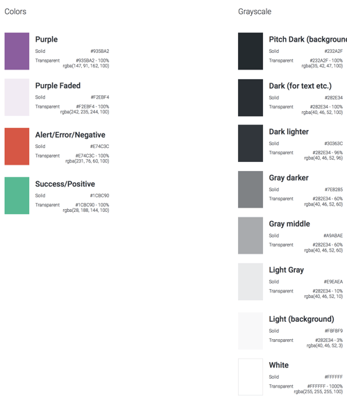
New color palette
From the palette, we could test the different pages using high-level sketches to see how they worked. This allowed us to do quick iterations before arriving at a color palette that satisfied our needs.
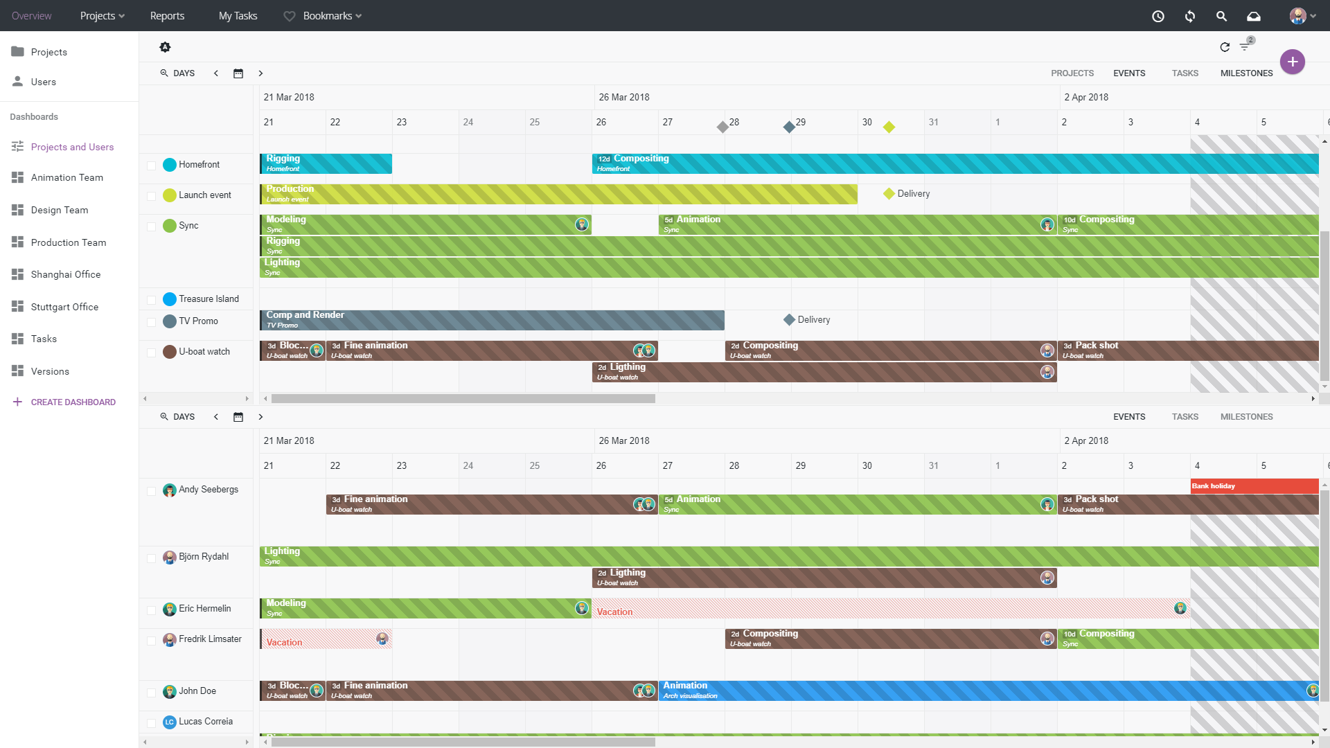
Projects and Users overview in light theme
Welcome to the dark side
The dark theme has also seen a major overhaul, perhaps even more so than the light theme. Contrast has been vastly improved making it easier to distinguish variations, and the colors are now more consistent across the whole application.
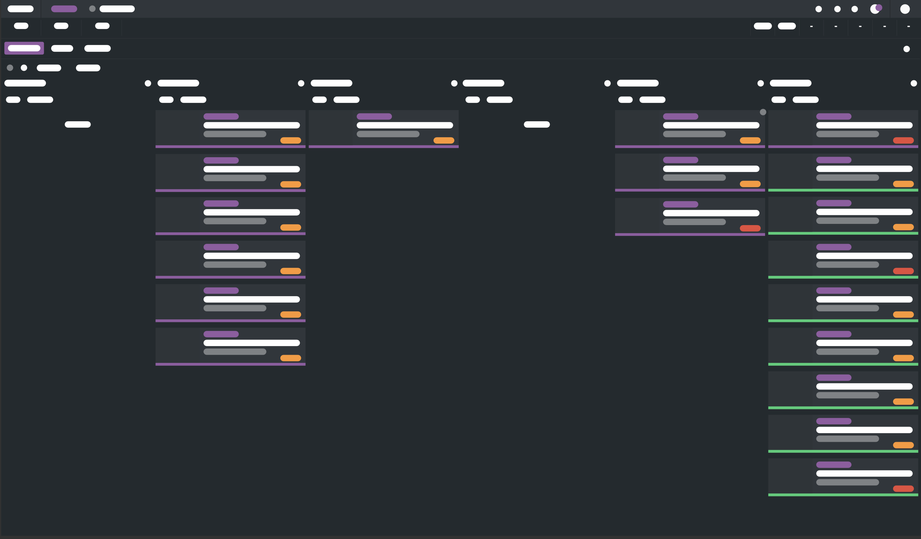
High-level sketch of the dark theme
Starting out as a “bonus feature” for a few users, the dark theme has become increasingly popular over time and is now preferred by many of our users. All new designs and features are tested with both color palettes and the new Review product will be released with the dark theme as default.
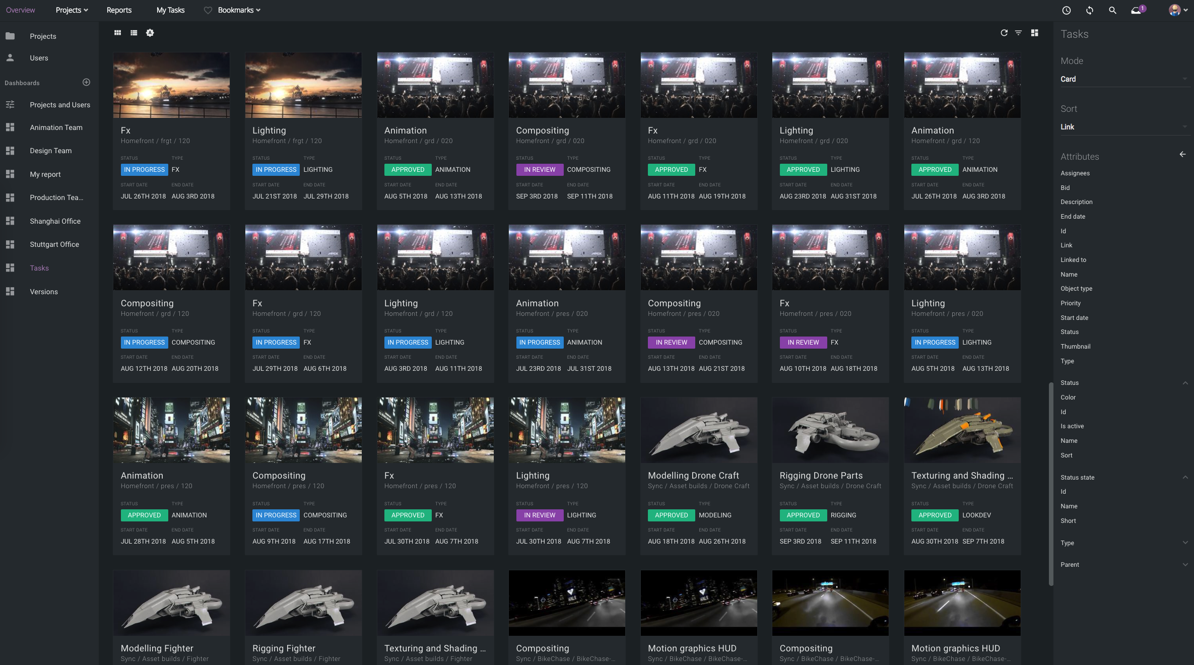
Cross-projects view in dark theme
The new themes are available immediately. Sign up for a free trial of ftrack Studio to see how managing creative projects can improve your team’s efficiency.